(04)
Solem
Services
Branding / Packaging / Product Visualization
Year
2026
Credit
Designed by Random Artifacts.
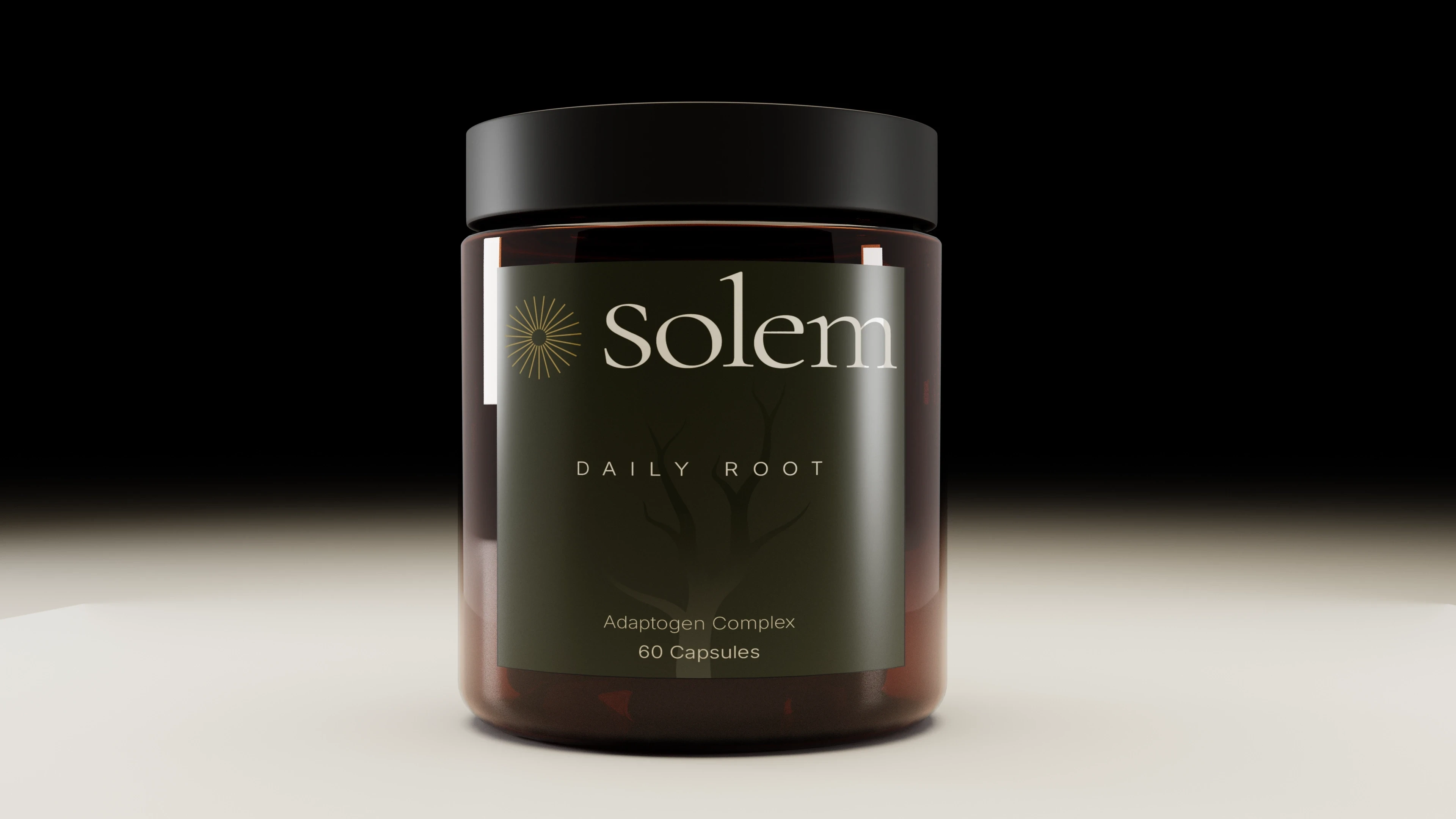
An apothecary-minded identity and packaging system for a slow-wellness supplement and adaptogen brand, spanning a jar, a bottle and a sachet.
Overview
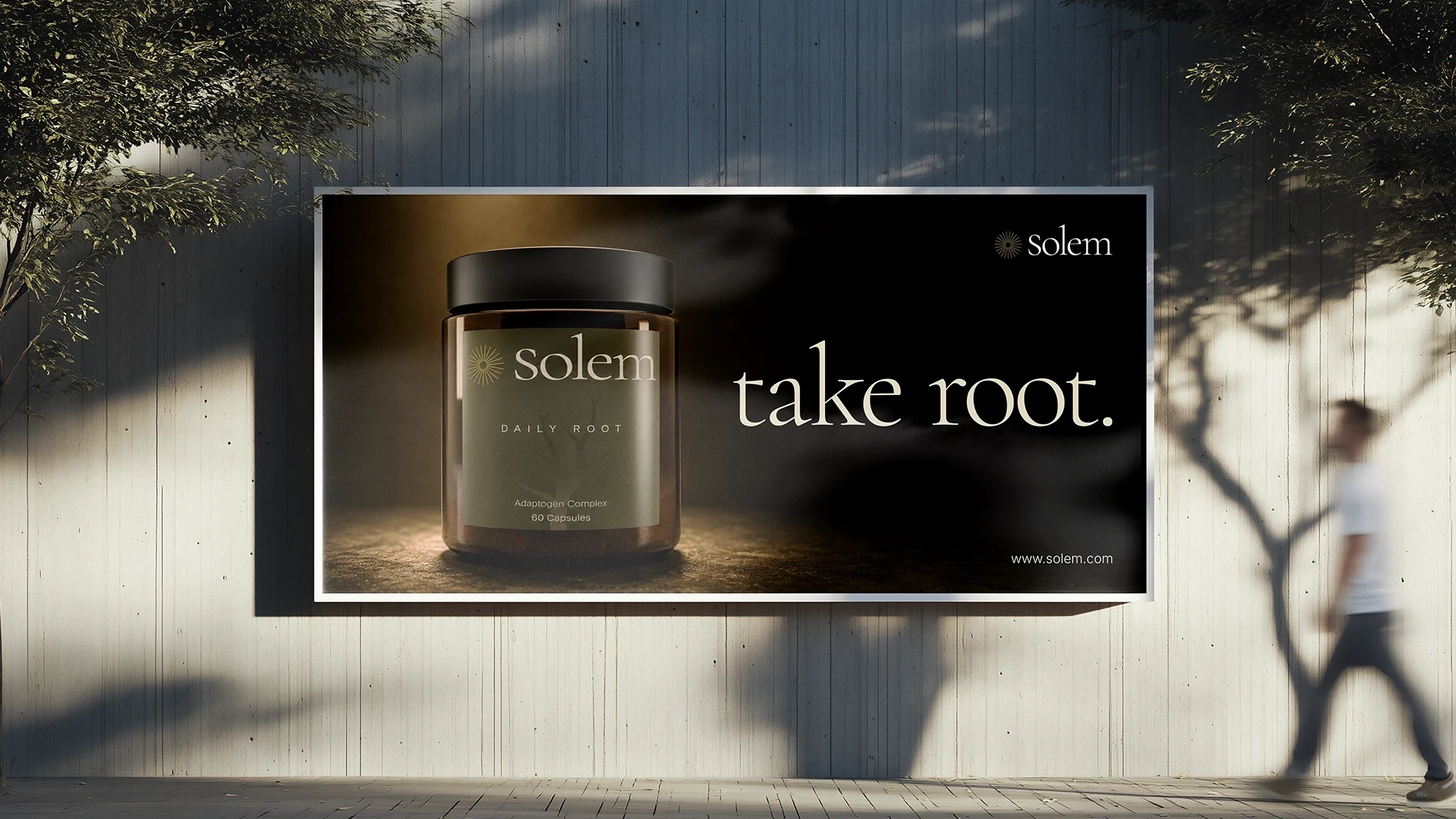
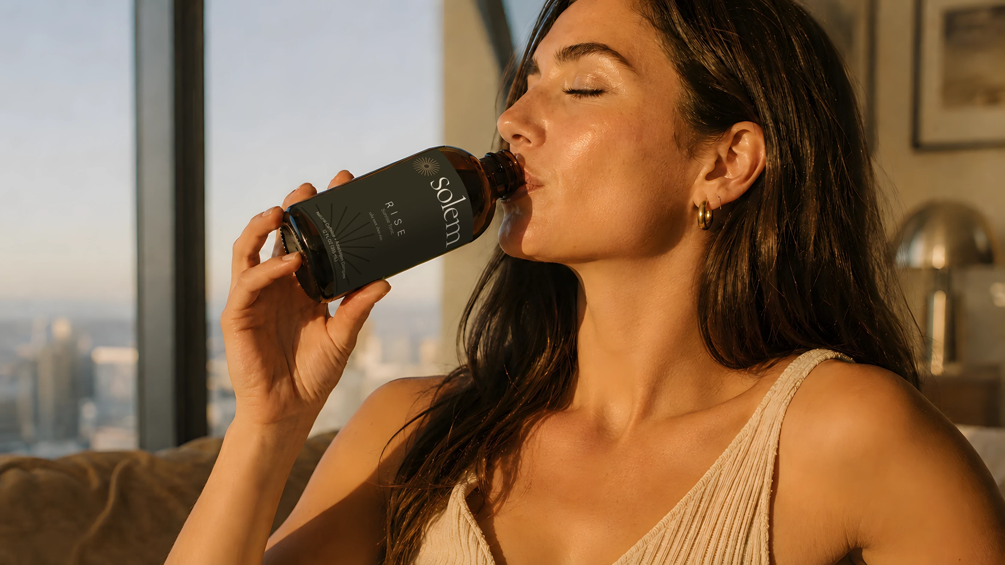
Solem is a supplement and adaptogen brand built for a slower kind of wellness, with formulas designed to support the body's natural rhythms rather than force quick results. The brand needed a full visual identity and packaging system to match that philosophy: something that felt closer to an apothecary than a vitamin aisle. The scope covered brand identity, logo and mark design, packaging for three products, and a visual language built to extend across the line. Daily Root is an adaptogen complex in capsules. Rise is a bottled formula. Warm Root is a 1 oz digestive and calming herbal tonic sachet.
The challenge
Supplements tend to split into two camps: sterile and clinical, or loud and hype-driven. Neither fits a product built on patience and long-term results. Solem needed to feel premium and credible without pharmaceutical coldness, and its system had to hold together across a jar, a bottle and a sachet without losing its voice.
The work
The identity borrows from apothecary tradition and from perfumery rather than the supplement shelf. A sunburst mark and a root motif carry the idea of energy from above and stability from below. A deep olive and warm ivory palette with one restrained gold accent replaces the category's usual pastels and clinical white. An editorial serif wordmark, a letter-spaced sans product name and minimal descriptor copy keep each pack quiet and confident. One label hierarchy runs across the jar, the bottle and the sachet, so every new formula reads as part of the same family.


(Next project)
Hunt Developers
View project →
